When I first started creating flyers and graphics for client’s social media, I would spend hours trying to find the perfect fonts. One of the hardest parts for me was the massive selection and variety to choose from. Not only do your fonts have to be aesthetically pleasing, but they also need to be legible and cohesive to the overall design. I’ve created a list of tips that help in my decision-making process:
1. ESTABLISH THE STYLE
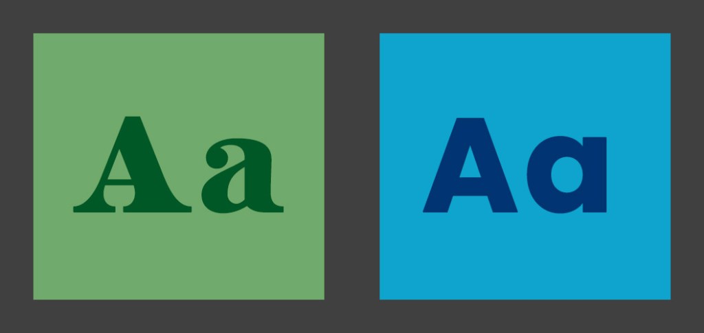
Since the options are endless with fonts, the first step you should take is choosing what typeface you want to use. You can significantly narrow down the options by choosing to use a serif, sans serif or script font.
It’s also important to look at the client and make sure the fonts will make sense. By choosing fonts that pair with the client’s existing social media—traditional or fun, elegant or edgy—you can attract the right customers.
2. LOOK THROUGH FONT DIRECTORIES
The easiest way to level up a flyer for social media is by choosing fonts that aren’t used everywhere. When I first started designing, I didn’t have access to Adobe Creative Cloud and wanted to elevate my projects past default fonts. So I utilized websites like Dafont and GoogleFonts. Both are free, easy to navigate and offer thousands of options.
If you have access to Adobe Creative Cloud, I highly recommend taking advantage of the font library they offer. Fonts you active automatically sync to your Photoshop and Illustrator. Plus they are already licensed for personal and commercial use.
3. LIMIT THE NUMBER OF FONTS
Flyers on social media aren’t meant to have lots of copy. Partly due to the small canvas size platforms support, and partly because people won’t stick around long enough to read everything. With that being said three fonts is the max I use for a flyer. Generally one font for the title and one/two for the supporting copy. Any more than that can get pretty busy and overwhelming for the audience.
4. CREATE CONTRAST
If I am struggling with the cohesiveness of a project, creating contrast is my next step. This can be achieved in a variety of ways. I recommend trying to mix font styles, sizes and different color combinations.
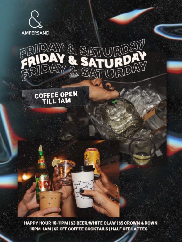
Ampersand is a coffee shop with a youthful brand image. I used a bold serif for the title in hopes to grab people’s attention. Then a sans serif for the smaller details.
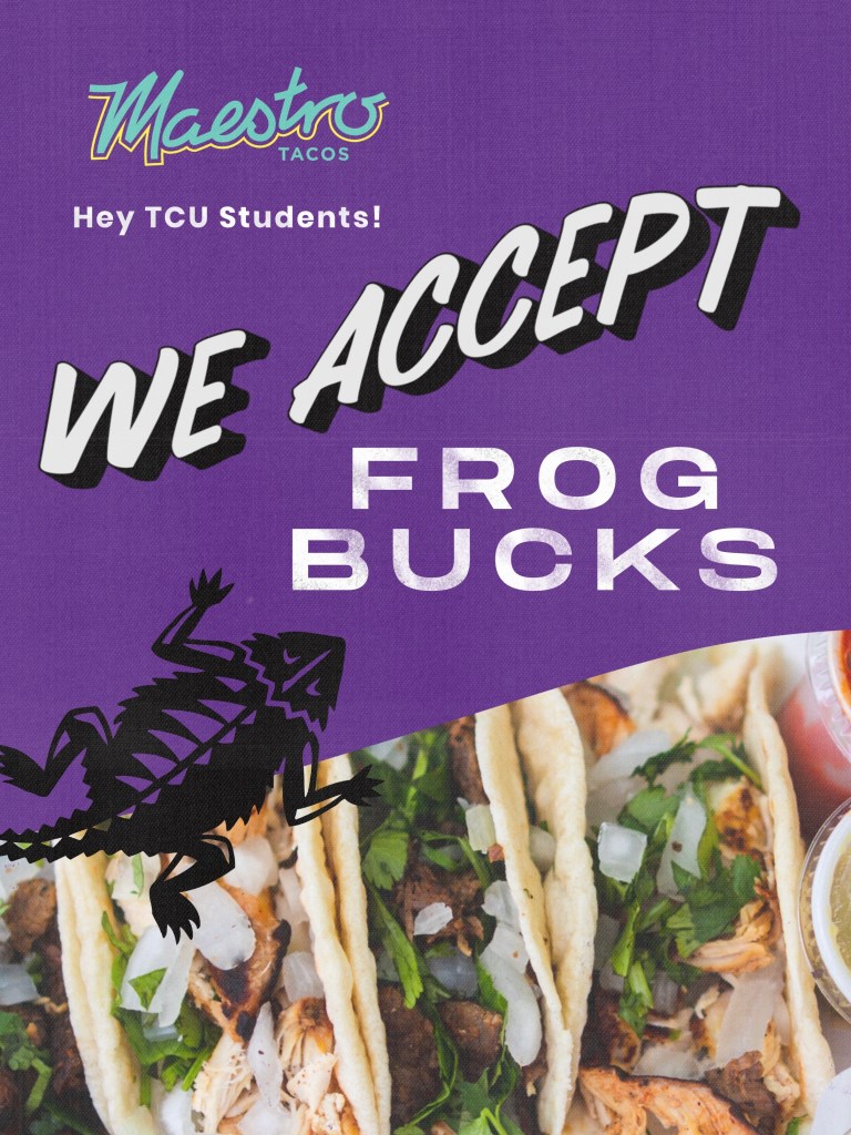
Maestro Tacos is an authentic taqueria and has a simple brand image. I chose a hand-lettering font for “we accept” to compliment the murals they have in the restaurant. Then a rustic sans serif to create contrast.
